Software.com
AI Impact & Adoption
The product built to answer what every engineering leader is asking.
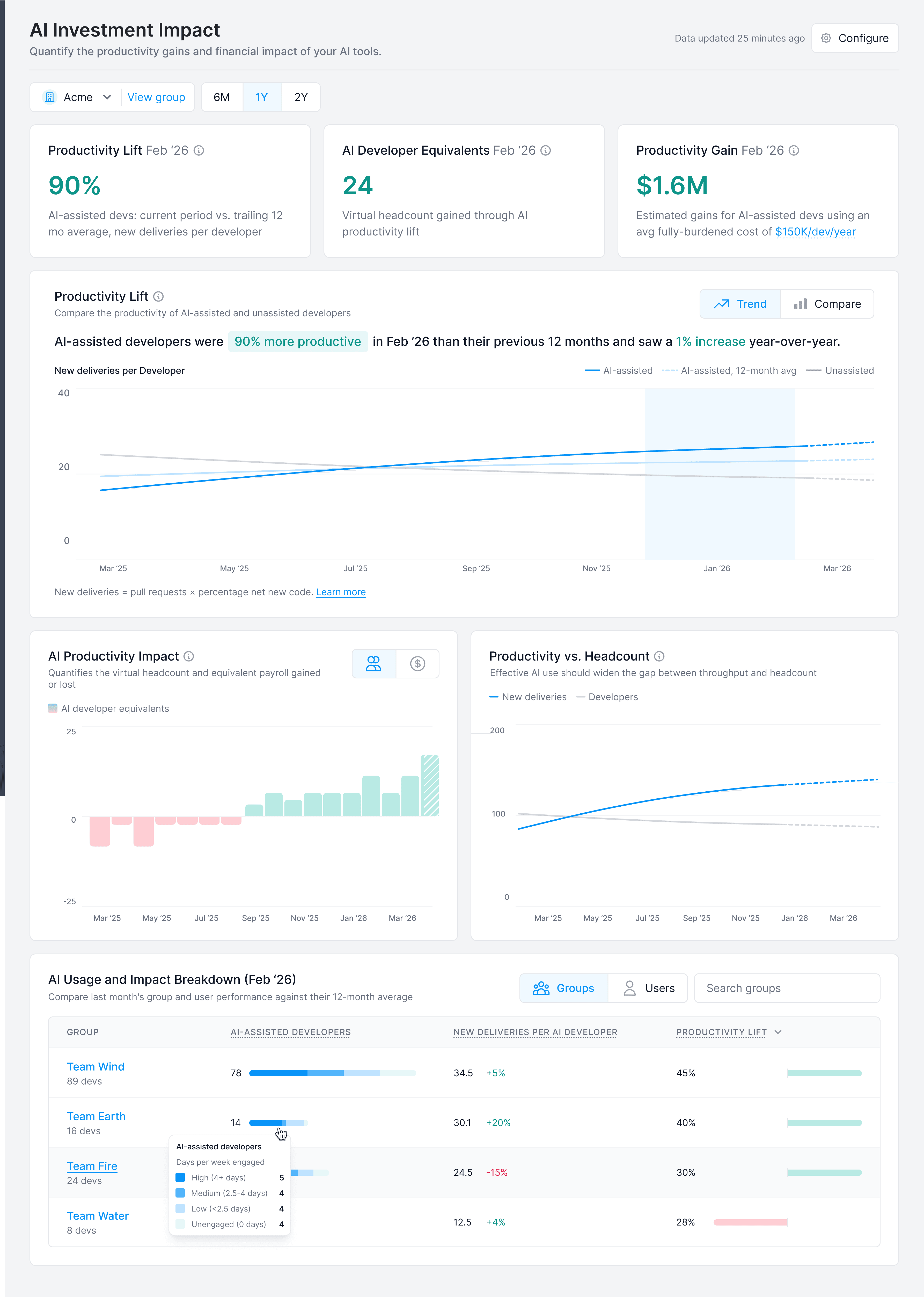
The Investment Impact dashboard — productivity lift, AI developer equivalents, and estimated dollar gain, each measured against every developer's own prior 12-month baseline.
Context
By 2023, most engineering organizations had deployed at least one AI coding tool. GitHub Copilot, Claude Code, Cursor, Tabnine: the options kept arriving, and so did the organizational pressure to adopt something. Boards were asking whether the company was keeping up. CTOs wanted to know if their teams were genuinely using the tools they'd paid for. CFOs wanted to understand what the spend was actually buying. Software.com was already the platform engineering leaders relied on to measure developer productivity, and adding AI adoption to that picture was a natural extension of what we were already building, though it turned out to be harder than we expected.
The Problem
Tracking usage wasn't the hard part; most tools exposed that through APIs. The harder problem was connecting usage to outcomes in a way that was honest, defensible, and actionable. Say sixty percent of your developers used Copilot this month. Did it make them faster? Did it introduce more bugs? Which teams were getting real value, and which weren't? What does $4,000 a month in Copilot seats actually buy you compared to last quarter?
Without answers to those questions, AI tool investment was essentially a faith-based exercise. Engineering leaders were renewing contracts, expanding seat counts, and choosing between competing tools with no real data to stand on. There was also a secondary problem that kept coming up in customer conversations: uneven adoption. In almost every organization we talked to, a small group of developers had become dramatically more productive with AI tools while a much larger group had barely touched them. The high performers weren't being identified or learned from, and the low adopters weren't getting any support.
The Approach
We started by working through what “AI impact” actually meant in measurable terms. Productivity is famously hard to measure for knowledge workers, and adding AI to the mix made it more contentious. We needed metrics grounded in output rather than activity — lines of code written is a poor signal; features delivered per developer is a better one.
The Investment Impact page was the hardest design problem. We were essentially building a CFO-facing financial model inside a developer tool, and the numbers needed to be credible enough to put in a budget review. A key early decision: rather than comparing AI users to non-users, we measured each developer against their own 12-month rolling average. That made the baseline personal and defensible. Instead of arguing about whether your best developers happen to use AI tools, you're showing whether a given developer improved after adopting them.
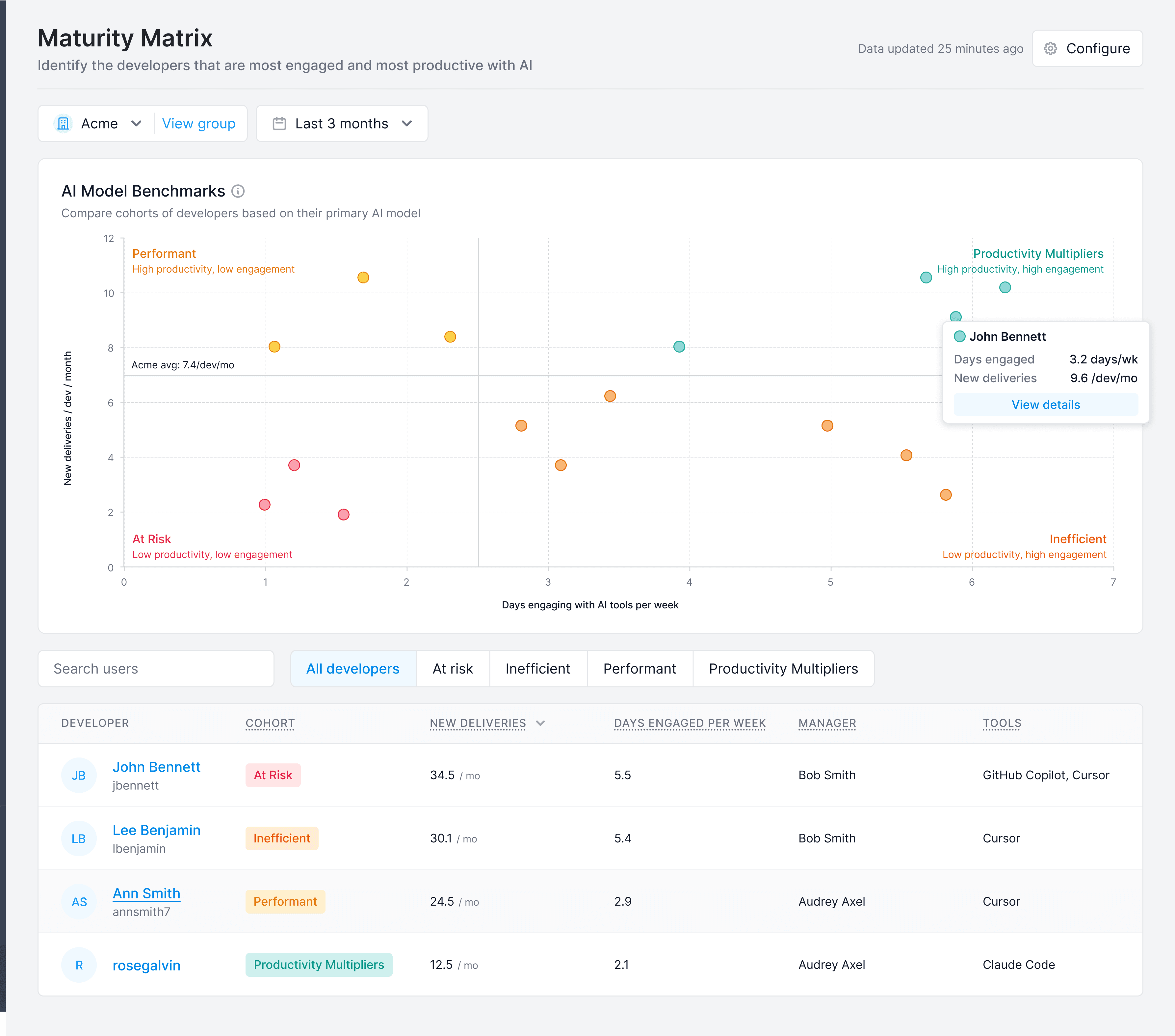
The Maturity Matrix came from noticing that adoption rates alone didn't tell the full story. The matrix plots every developer in the organization across two dimensions: productivity and AI engagement. The resulting map immediately shows who the champions are (high engagement, strong productivity gains), who the holdouts are (low engagement, leaving value on the table), and who the inefficient users are (high engagement but weak productivity gains, meaning they need coaching to get real value from the tools). Leaders can spot the people others should learn from, and the people who need support.
The Solution
Investment Impact
The top-level dashboard led with a question that turned out to be more precise than it first appeared: are AI-assisted developers more productive now than they were before? Three summary metrics sit above the fold: productivity lift percentage, AI developer equivalents gained, and estimated productivity gain in dollar terms. Enough to take into a budget review.
AI Utilization
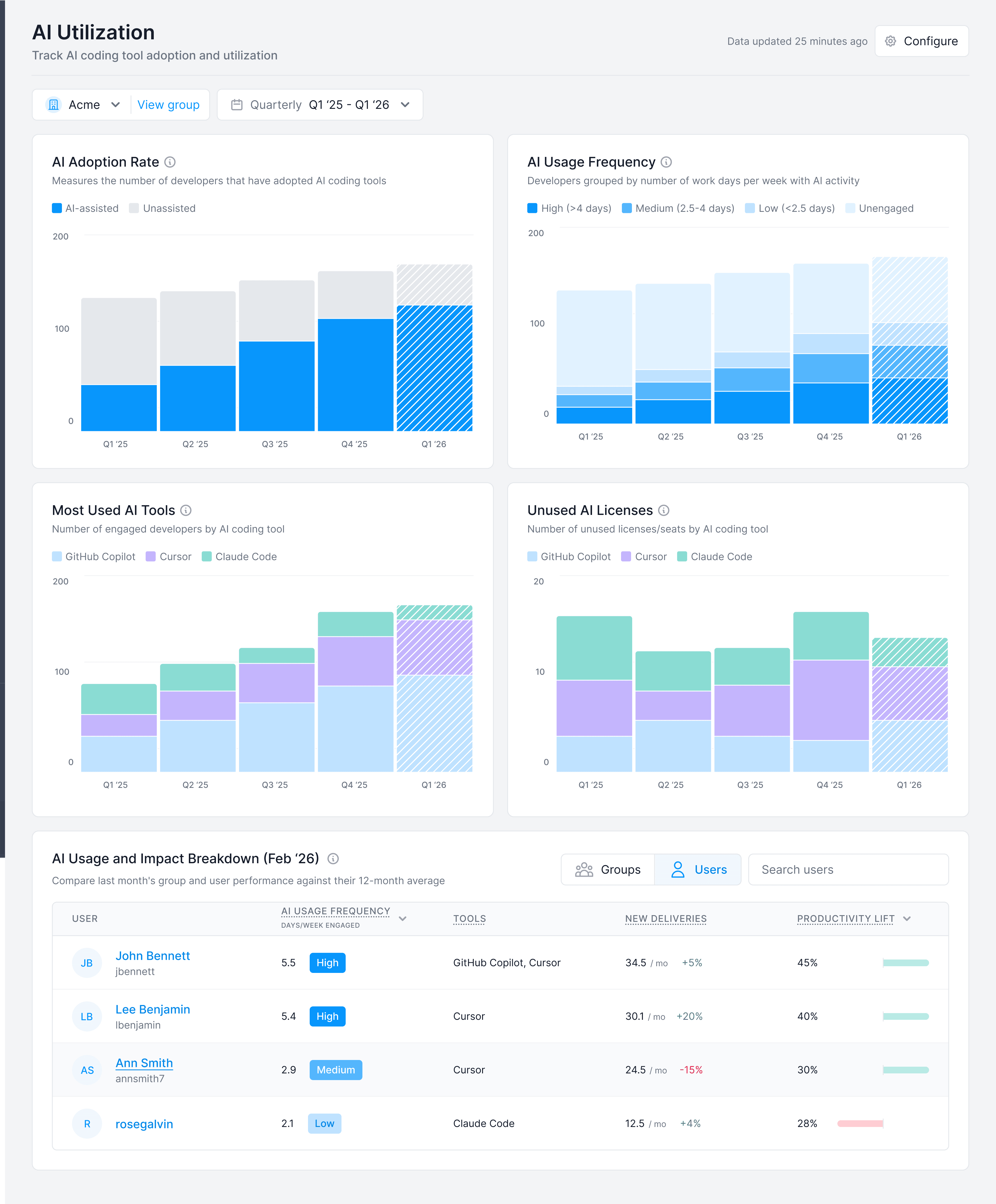
The Utilization page shifted focus from “is it working?” to “who's using it and how?” It tracked adoption rate over time, usage frequency broken down by engagement level, a comparison of which tools were being used most across the organization, and, critically, unused licenses. That last chart addressed one of the most common complaints we heard: customers were paying for seats that nobody was using and had no visibility into it.
Maturity Matrix
The Maturity Matrix plots every developer in the organization across two dimensions: productivity and AI engagement. The resulting map surfaces three distinct groups: champions (high engagement, strong productivity lift) who other developers can learn from; holdouts (low engagement) who need to be nudged into adopting the tools; and inefficient users (high engagement, low productivity gain) who are using the tools but need training to get real value from them. It turns a vague question like “how are we doing with AI?” into something you can actually act on.
The Outcome
AI Impact & Adoption became one of Software.com's most actively used product areas at a moment when every engineering organization was trying to answer the same questions. The Investment Impact framework in particular has been used by customers in budget reviews and board presentations — validating the early bet that the design needed to work at the executive level, not just for engineering managers. The baseline-relative measurement approach proved to be the right call: it made the numbers harder to dismiss and easier to act on.